Today the window display tells who we are, creates a relationship between brand and customer and tells a story that is renewed month after month. Programming the setups therefore does not simply involve the logistics of moving scenic materials, but creating a long-lasting visual story able to excite the customer throughout the year.
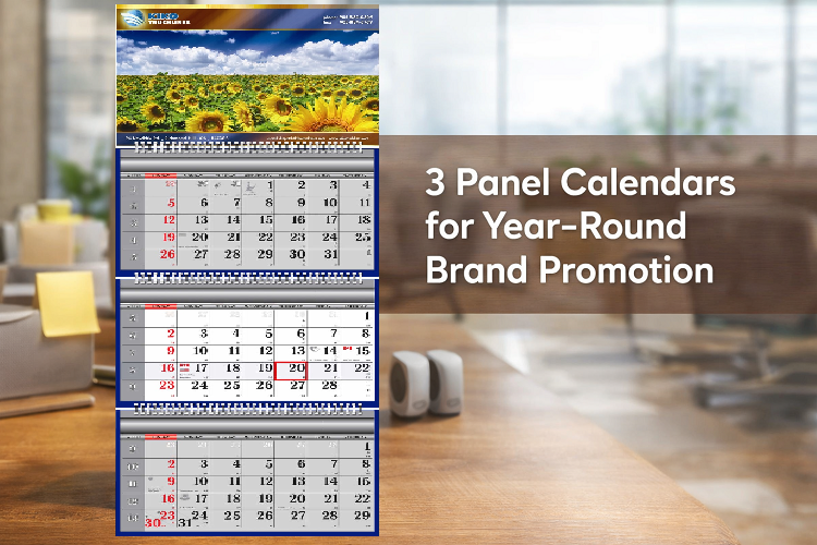
In this article we will see how to create 3 Panel Calendars that will allow you to program windows always ready to tell captivating stories.
Planning your stories better: why have an annual calendar for window displays?
Planning an annual calendar allows you to manage your windows with more strategy, saving time and resources. This allows you to better manage materials and suppliers, programming advertising campaigns at the right time and above all it creates a visual continuity that strengthens your brand identity.
But there’s more. Having a detailed calendar of your setups also makes it possible to better distribute your investments throughout the year, avoiding concentrating expenses only in a few moments and making your impact on the public more consistent. Continuity is one of the fundamental factors on which to build trust: maintaining your window display every month, with care and professionalism, tells the customer that you are attentive and present in the territory.
Spring, summer, autumn: rhythms and patterns that dictate trends in fashion, but also in visual merchandising.
Spring: time to renew
Colors brighten up, materials become lighter and softer, details recall natural elements. Stories about awakenings, transformations and lightness unfold in the displays. Transparency becomes key: materials lighten up, compositions become more open and deconstructed to suggest fluidity. Nothing like spring to unveil new collections and awaken the desire for change! Playing on opposites is never a bad idea: blooms hanging from the ceiling, suspended or kinetic elements, a color palette that mixes references to the past and promises of the future.
Summer: time to play
As temperatures rise, communication takes a more impactful turn. Colors become saturated, compositions more dynamic and “fun” atmospheres take over the scene. Visual references to outdoor living, travel and leisure time are commonplace. The window turns into an escape valve, a moment of visual oxygénation to break up the daily grind. When summer comes around, it’s all about instilling a sense of freshness and lightness in your windows, creating a visceral link between the product and the pleasure of enjoying the season to its fullest.
Fall: time to reconnect
Back to school, back to work. Fall is a time of transition when we turn our attention inward once again. Visual merchandising matches this renewed focus with darker tones, richer materials, and tighter compositions. Expect to see stories revolving around lifestyles, daily life and functional luxury. Deep blues and earthy tones, warm and soft lighting, props in raw materials such as wood, wool or ceramic.
Harmonizing marketing and visual: integrated planning power
Personalized gift calendars Canada designed correctly makes sense when harmonized with the brand’s marketing and communication actions. In this context, the visual ceases to be an independent element and becomes the physical embodiment of an omnichannel strategy in which each installation is reflected by social campaigns, newsletters, new products and in-store events. The result? Greater consistency of the message, increased efficacy of promotional initiatives and an identifiable storytelling that never stops talking across touchpoints.
Want to discover how to build an effective calendar and harmonize visual and marketing through integrated planning? Book a personalized consultation with Canada Custom Calendar.